Low Poly Portrait
In this post, I share one of my favorite graphic design projects – the Low Poly Portrait. It’s a student favorite too.
High Level Overview
From a high level, a low poly portrait is simply a portrait made of many triangles that share common edges that, when viewed from afar, illustrate depth and human likeness. The challenge of this project is ensuring that all common edges line up so that background colors don’t leach through or that triangles don’t overlap in an od manner. To address this, simply ensure that the anchor points of the common edges overlap precisely. To achieve this, I recommend turning Adobe Illustrator’s grid setting on and “snapping to grid” when using the pen tool. This can be achieved by adjusting your View settings. You may also need to hold Shift when clicking on existing anchor points to prevent the anchor point from being deleted.
Another challenge of this project is setting the grid to an appropriate size such that triangles can be easily made at an ideal size. In the video at the bottom of this post, I outline the steps you should take to ensure that everything goes smoothly.
Low Poly Portrait Reference Image
By no means should you expect to make a low poly portrait “freehand.” Instead crop an image as your subject to match the aspect ratio of the artboard you will be working in. It’s ok if the image is pixelated as you really only need the average color of a general areas in a picture. Be sure to lock the object in the Layers panel to prevent the reference from moving. I also suggest using a reference picture of your subject wearing sunglasses, as eyeballs are difficult to get right with this technique.
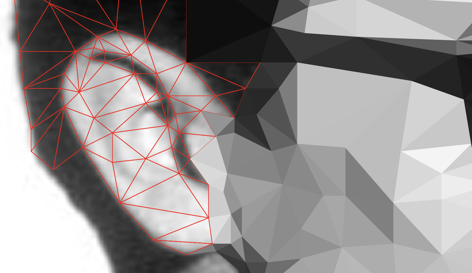
Triangles
As you’ve likely guessed by now, you’re going to be making a lot of triangles in this project. Probably the toughest part of getting this right is knowing how big to make the triangles. Essentially, what you want to do is divide similar areas of color into triangles. Detailed areas like the nose and ear will require many more triangles than say a shirt or hair. It’s also helpful to think about outlining the boundaries of your subject matter with the edges of the triangles.
See the image below, which features a section of a James Dean low poly portrait, and note how the edges of the triangles trace the outer edge of his ear.
Tips and Tricks
Sometimes while working, the grid will visually get in the way. I teach my students the keyboard shortcut Command + Apostrophe to toggle it on and off. I also keep my fill settings to transparent and use a .5 pt stroke of a contrasting color when making my triangles. To fill the color, I use the eyedropper tool to select the color in the middle of the triangle. As long as your reference image doesn’t have a stroke, your triangle should inherit the properties appropriately.
Using the keyboard shortcut V and I will allow you to switch between the selection tool and eyedropper rapidly.
Background
The low poly portrait really pops when it’s juxtaposed against a two color radial gradient background. I position the gradient directly behind the subject’s head. It works to provide focus and enhances the stylistic impact of the low poly technique.
Video Demo
Resources
For your convenience, I’ve provided a file below for download. It is an Adobe Illustrator file that is set to 18″ x 24″ and has a grid prebuilt that is ideally suited for this project. I’ve also included a partially completed version of the James Dean low poly portrait featured above for you to use for demonstration purposes.
Recommended

The Not Adobe Creative Suite
Read More >>
Low Poly Portrait
In this post, I share one of my favorite graphic design projects – the Low Poly Portrait. It’s a student favorite too.
High Level Overview
From a high level, a low poly portrait is simply a portrait made of many triangles that share common edges that, when viewed from afar, illustrate depth and human likeness. The challenge of this project is ensuring that all common edges line up so that background colors don’t leach through or that triangles don’t overlap in an od manner. To address this, simply ensure that the anchor points of the common edges overlap precisely. To achieve this, I recommend turning Adobe Illustrator’s grid setting on and “snapping to grid” when using the pen tool. This can be achieved by adjusting your View settings. You may also need to hold Shift when clicking on existing anchor points to prevent the anchor point from being deleted.
Another challenge of this project is setting the grid to an appropriate size such that triangles can be easily made at an ideal size. In the video at the bottom of this post, I outline the steps you should take to ensure that everything goes smoothly.
Reference Image
By no means should you expect to make a low poly portrait “freehand.” Instead crop an image as your subject to match the aspect ratio of the artboard you will be working in. It’s ok if the image is pixelated as you really only need the average color of a general areas in a picture. Be sure to lock the object in the Layers panel to prevent the reference from moving. I also suggest using a reference picture of your subject wearing sunglasses, as eyeballs are difficult to get right with this technique.
Triangles
As you’ve likely guessed by now, you’re going to be making a lot of triangles in this project. Probably the toughest part of getting this right is knowing how big to make the triangles. Essentially, what you want to do is divide similar areas of color into triangles. Detailed areas like the nose and ear will require many more triangles than say a shirt or hair. It’s also helpful to think about outlining the boundaries of your subject matter with the edges of the triangles.
See the image below, which features a section of a James Dean low poly portrait, and note how the edges of the triangles trace the outer edge of his ear.
Tips and Tricks
Sometimes while working, the grid will visually get in the way. I teach my students the keyboard shortcut Command + Apostrophe to toggle it on and off. I also keep my fill settings to transparent and use a .5 pt stroke of a contrasting color when making my triangles. To fill the color, I use the eyedropper tool to select the color in the middle of the triangle. As long as your reference image doesn’t have a stroke, your triangle should inherit the properties appropriately.
Using the keyboard shortcut V and I will allow you to switch between the selection tool and eyedropper rapidly.
Background
The low poly portrait really pops when it’s juxtaposed against a two color radial gradient background. I position the gradient directly behind the subject’s head. It works to provide focus and enhances the stylistic impact of the low poly technique.
Video Demo
Resources
For your convenience, I’ve provided a file below for download. It is an Adobe Illustrator file that is set to 18″ x 24″ and has a grid prebuilt that is ideally suited for this project. I’ve also included a partially completed version of the James Dean low poly portrait featured above for you to use for demonstration purposes.
0 Comments