follow me on:
Creativity and Innovation in Teaching and Learning.
Join hundreds of other creatives and innovators to receive my weekly round up and occasional essays.
follow me on:
Join hundreds of other creatives and innovators to receive my weekly round up and occasional essays.
Welcome to my homepage. I'm so glad you are here.
I recently finished a complete overhaul of my website. If you're thinking it looks different than last time you were here, you are correct. It totally is.
I've tried to retain everything here that I considered valauble, with the exception that ALL of my archived and future articles will now live on Substack. It'd be pretty cool if you subscribed.
In the meantime, check out some of my online projects below. Thanks again for stopping by!

Actually, I wrote three books, and you can read them for free here
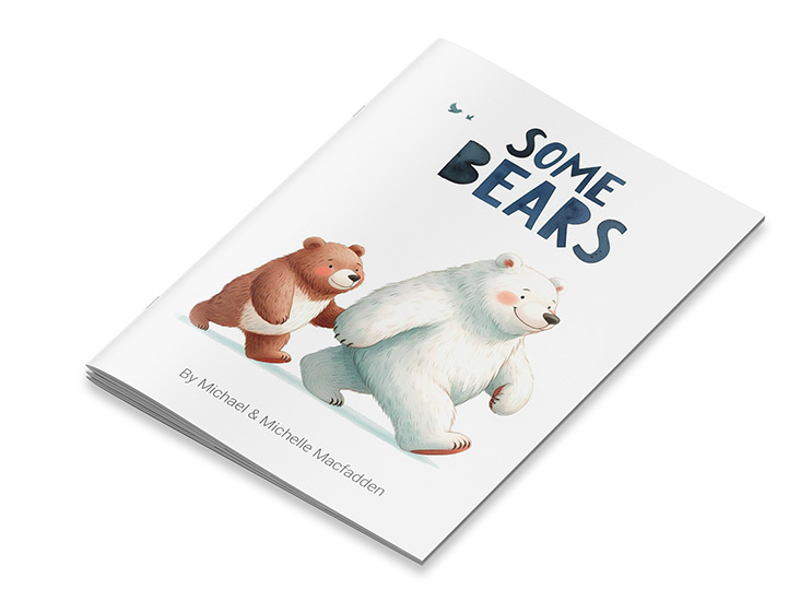
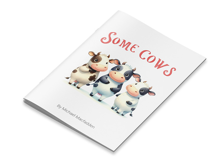
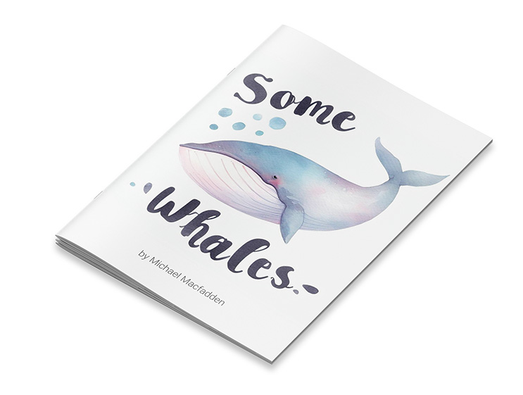
If you've read them here, and you want a hard copy for yourself, you can pick one up on Amazon.